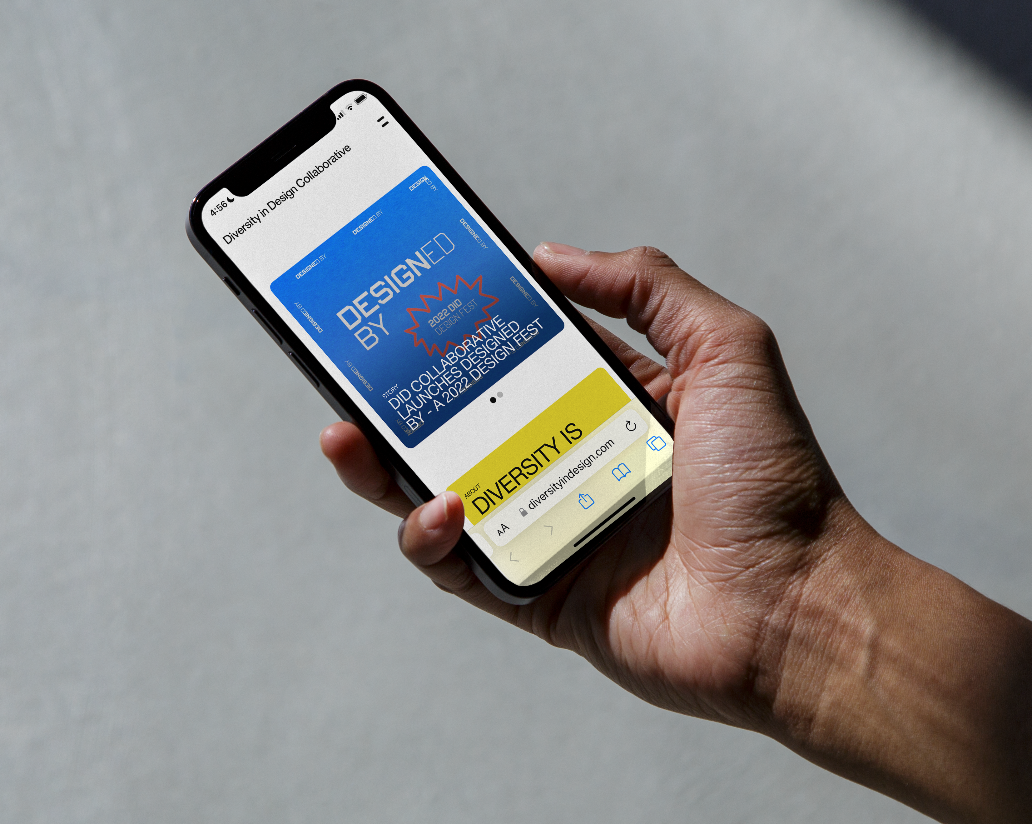
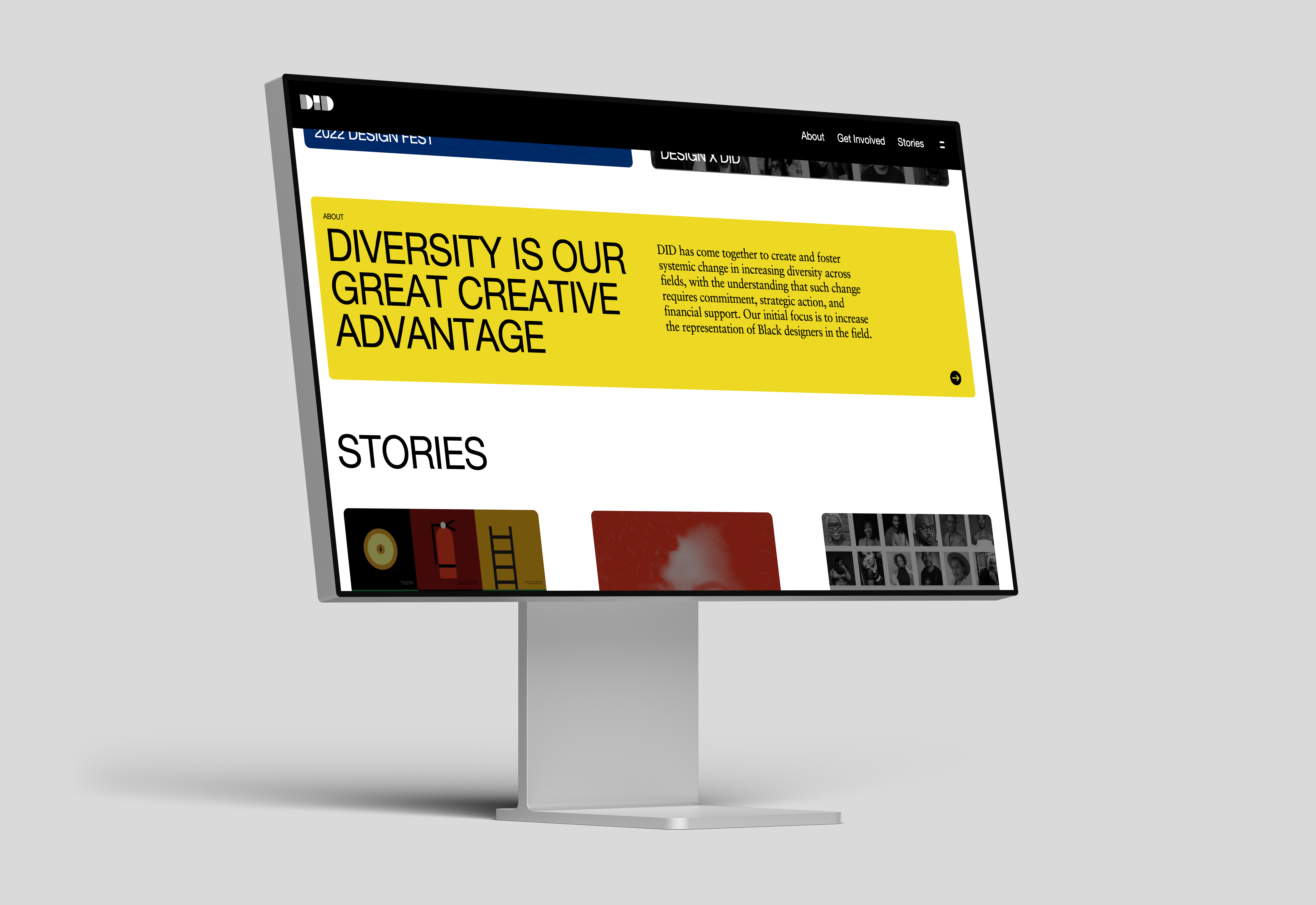
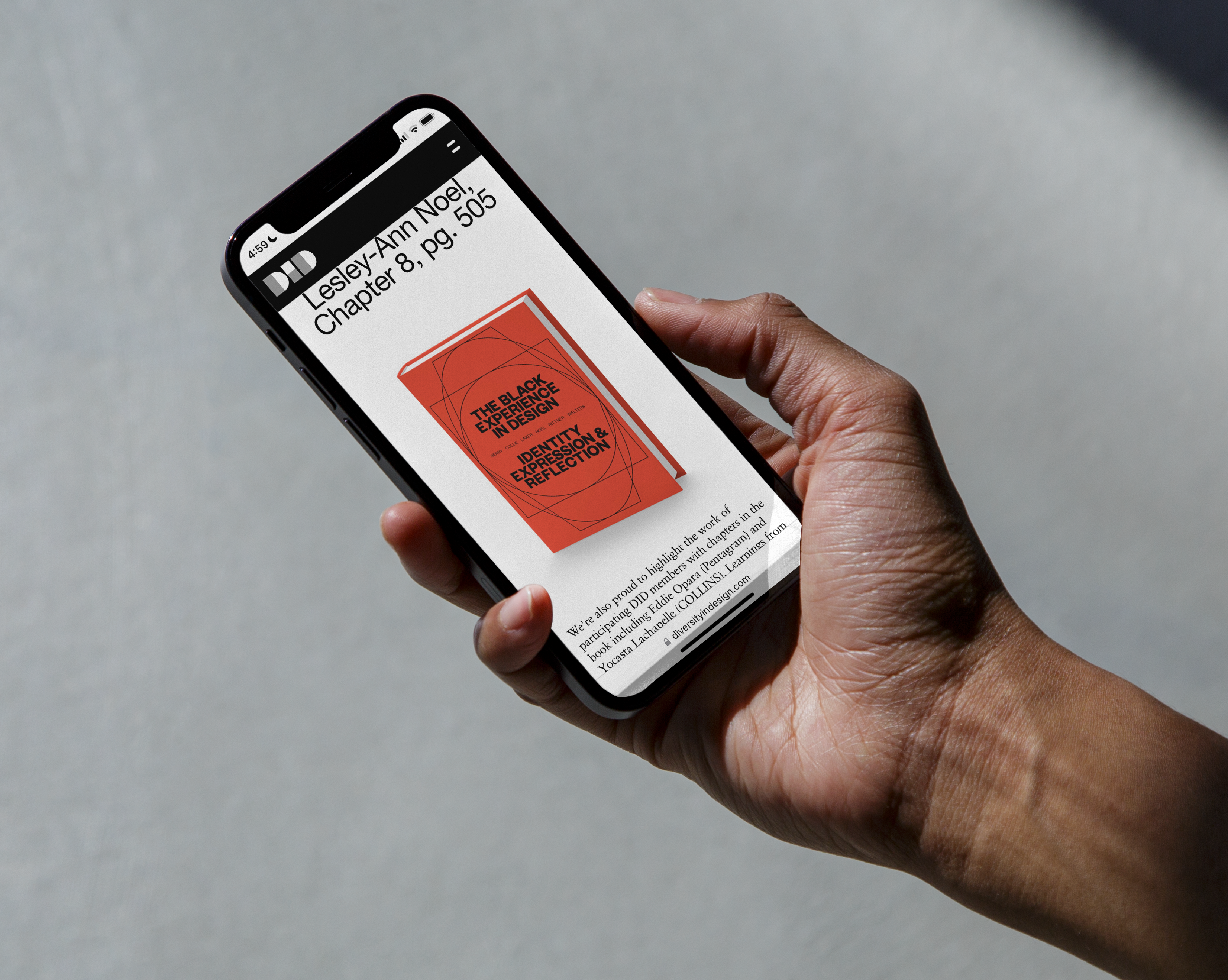
Web design for Herman Miller’s initiative, Diversity in Design. With creative direction by Room for Magic, I designed the site to be highly editorial, while maintaining clarity as the site also acts as a resource for black creatives. A great feature of the site, is the ability for the DID team to self-publish, and allow the content (stories, resources, etc.) to scale infinitely + consistently.

Mobile First
I started design for the mobile experience first. Featuring a square card design, this allows for continuity of images used on social, and across the website.
I started design for the mobile experience first. Featuring a square card design, this allows for continuity of images used on social, and across the website.


Editorial Feel
The website begins showcasing the top relevant stories published by the DID team, and everything below the fold follows suit.
The website begins showcasing the top relevant stories published by the DID team, and everything below the fold follows suit.

Full-screen Menu
Something the original DID website lacked, was easy navigation across the site. As the content grows for this current version, it’s critical for the user to access many parts of the site with ease.
This menu will also prove helpful when search gets integrated, as it creates a focal point, and the use of tags for all content.


Stories Focused
Each story page considered multiple elements that the DID team could leverage to help uplift the content. Images (aspect ratio, colors), body copy, and pull quotes to help immerse the reader even further.

 Please visit www.diversityindesign.com for the full experience
Tags: Website Design, Herman Miller, Diversity in Design, Digital, Mobile
©2022 MARTIEFLORES

